BRIEF
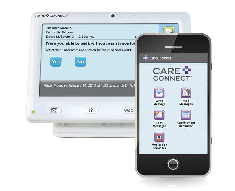
The product team at 12th Man Technologies were in the process of developing a touchscreen device specifically for older adults needing healthcare at home. I worked as the lead designer for the UX for the device and the corresponding phone app used by family and care providers.
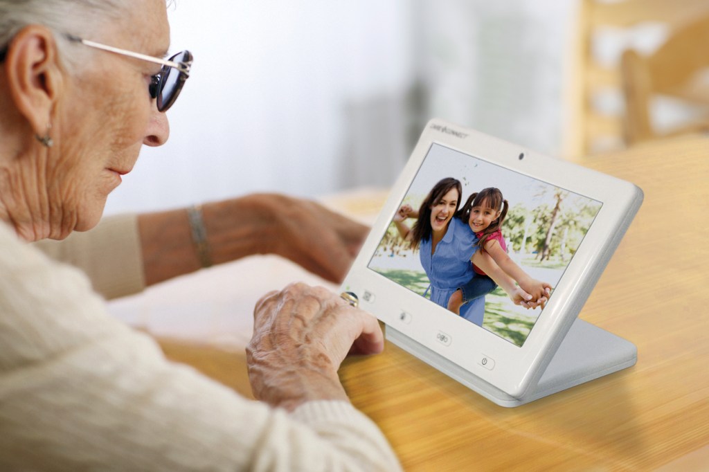
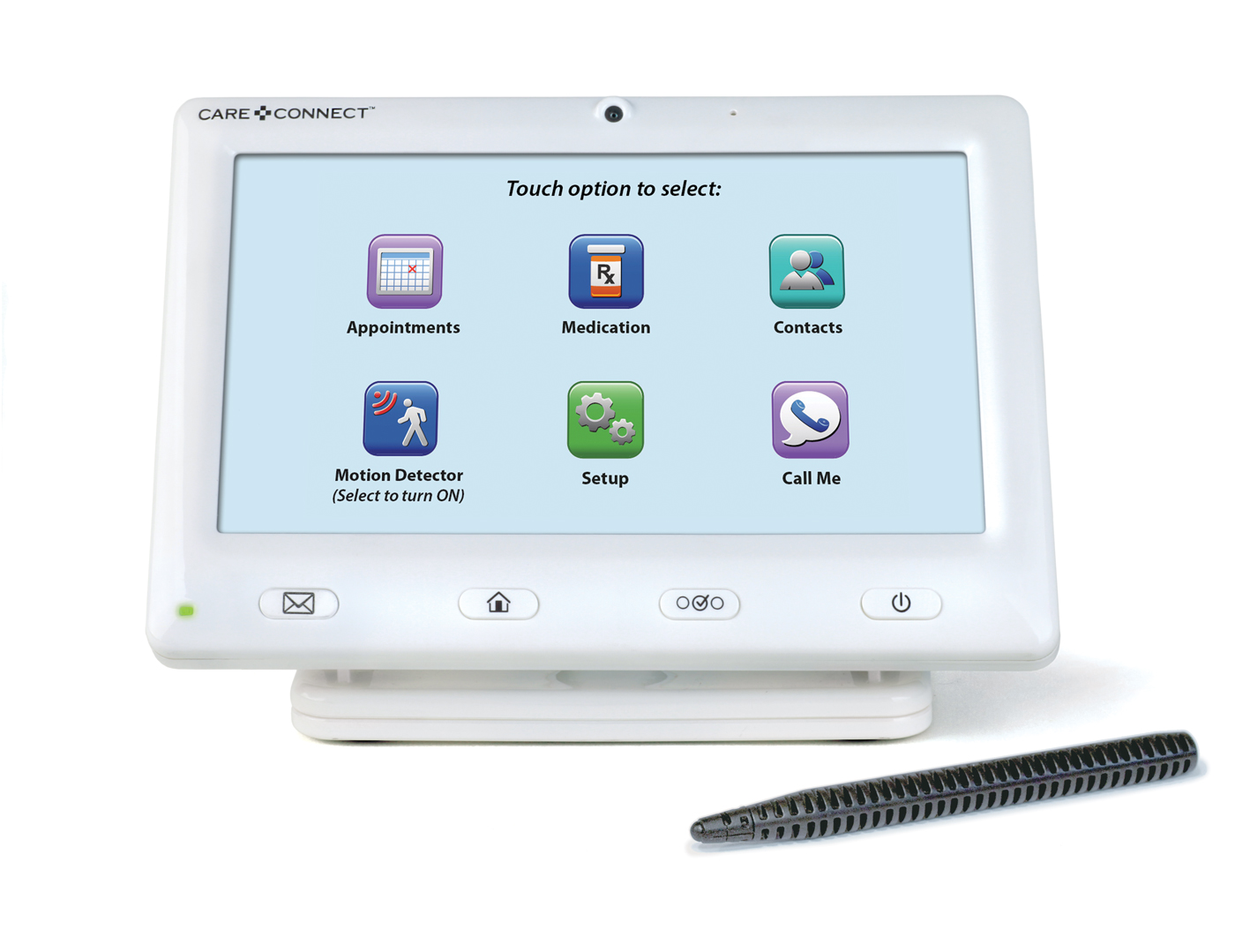
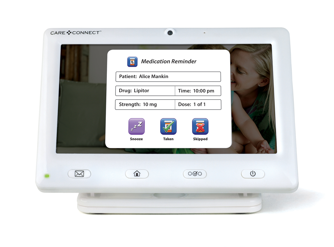
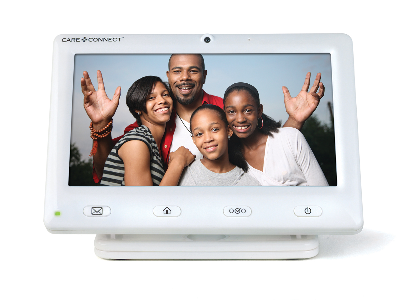
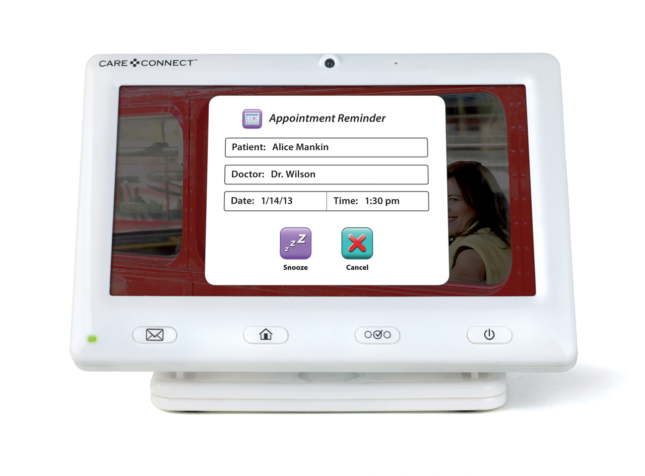
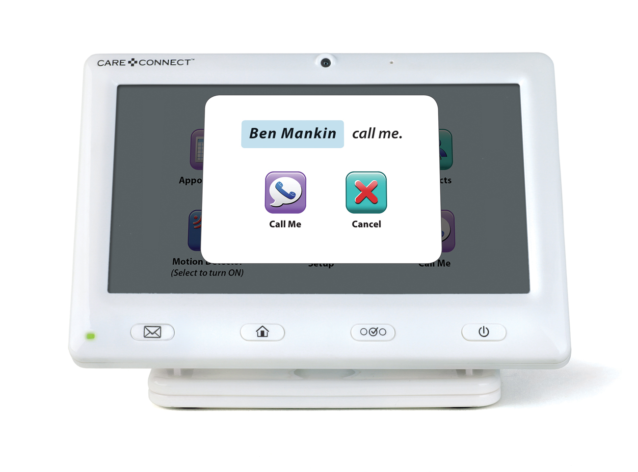
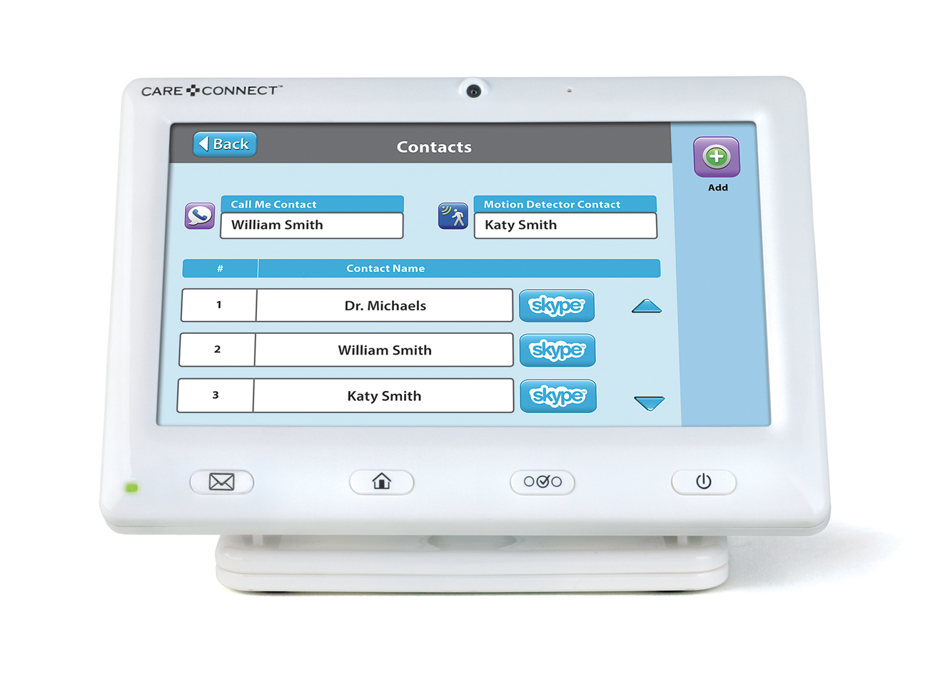
The device was intended to function as both a home care app, and would cycle through photographs as a digital photo frame while not in use. Functions included medication reminders, email and Skype video calls with care providers, emergency calls, appointment reminders, and weather forecast.
MY PART
I began with a discovery period and research for this target audience of elderly/home bound adults that struggle with using cell phones. Icons and typography were carefully selected to be understood and visually easy to read for the visually impaired. The goal was to make it simple, intuitive, and user friendly.
Once the color palette, button style, and typography were approved to work for this audience, I worked with the head product engineer to design the icons, menus, and the email platform. After designs were handed off, I worked with programmers to direct the user experience and test for QA.
Overall designs include:
- 60+ screens for digital menu
- 25 navigation icons
- 15 pop-up screens
- Modified icons for phone app
- weather icons
- emoticons
- icons for hard buttons
- drop down menus
TARGET MARKET
- Elderly and home bound adults
- Users not savvy with mobile devices
- Users with medical conditions
BRAND CULTURE
- Friendly and approachable
- Helpful technology
- Caring for family connections
- Home medical care
- Independence for elderly
