1: Portland Visitor’s Map re-design
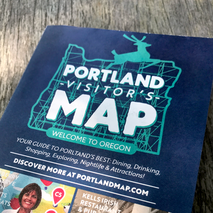
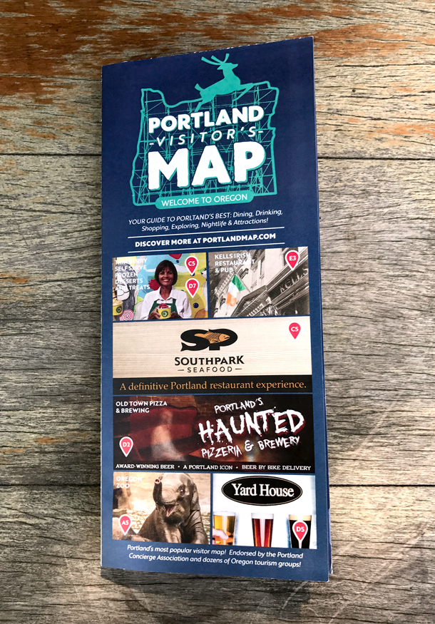
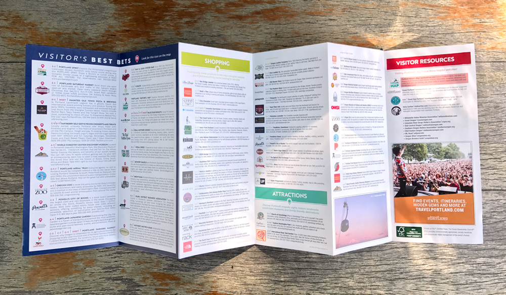
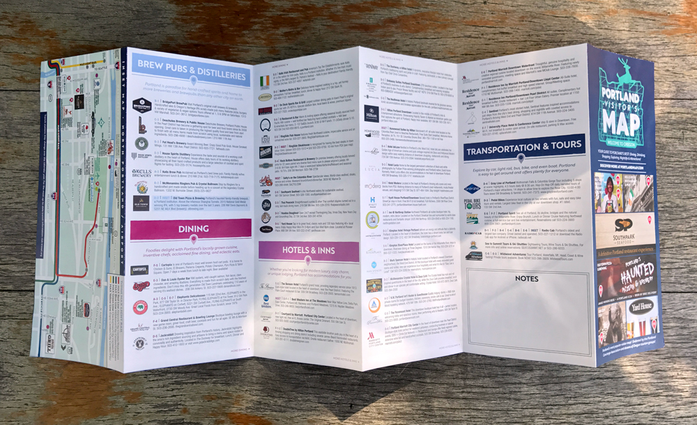
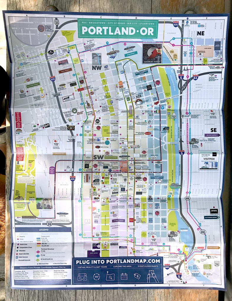
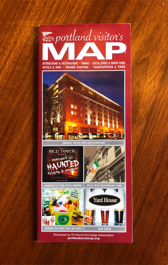
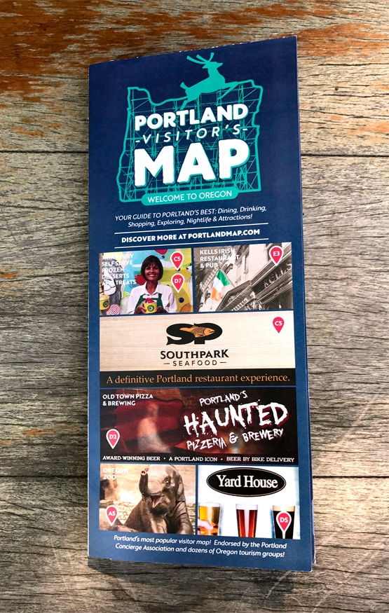
This accordion fold map was re-designed to update the long-standing Portland Visitor’s Map. I rebranded with a new logotype inspired by the White Stag sign on Burnside, along with fresh brand colors inspired by the iconic PDX airport carpet, as well as a new fonts and graphic elements to completely change the look and feel of the outdated brochure/map.
2: Book cover
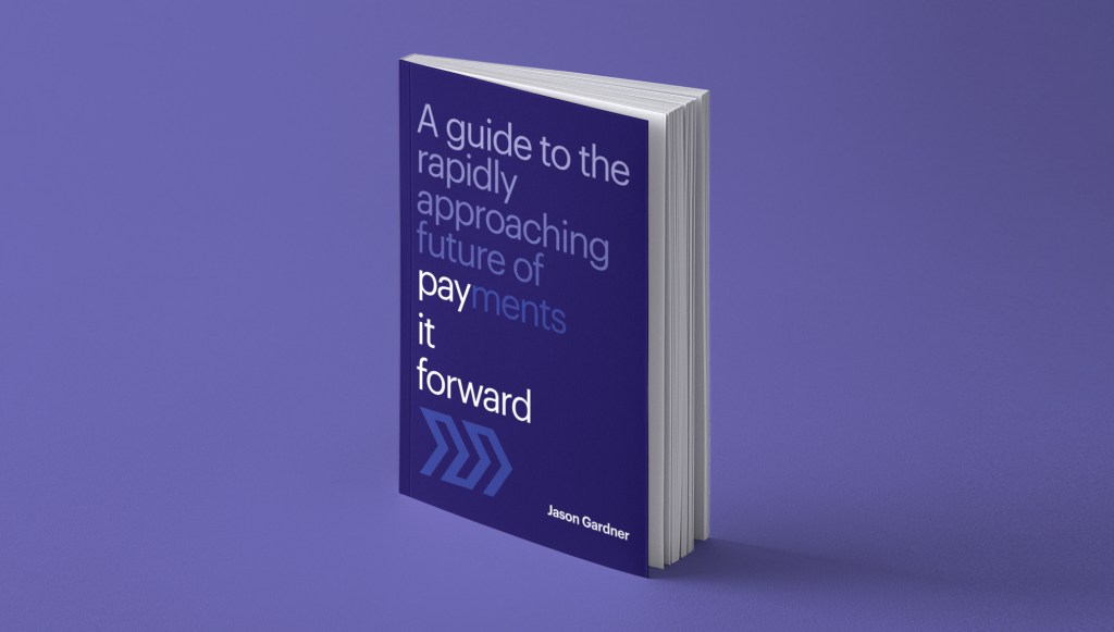
Pay it Forward was written by Marqeta Founder and CEO Jason Gardner. I art directed and finalized the cover art with the intention that it would be branded with the chevron and purple palette that is signature of the Marqeta brand, but with an interesting typographic layout to call attention to the title/subtitle.
3: IT Security Handbook

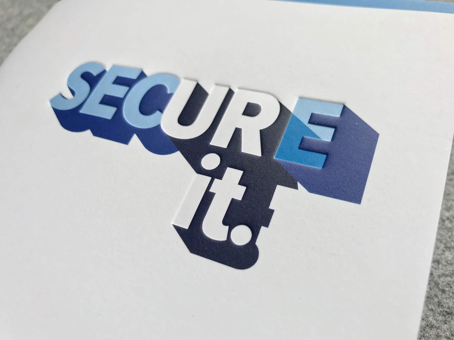


This handbook was designed for the IT Department of Portland General Electric as part of the SECURE it. campaign to educate employees on best practices in cybersecurity. Design finishing techniques include a deboss on the front cover to accentuate the white-on-white logotype.
4: City Auditor’s fraud campaign


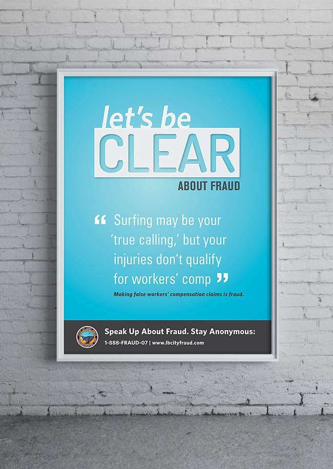


This print campaign re-conceptualized the anti-fraud messaging for the Long Beach City Auditor’s office by infusing a lighter tone to the message and visuals. This ‘Clarifying Fraud’ integrated campaign was selected as the winner out of three entries in a design competition and it was implemented city-wide. I art directed the “Let’s Be Clear” logotype, to be the staple message of the campaign. I co-wrote the quotes about types of fraud. I finalized the production and final printing of all assets.
5: Educational article
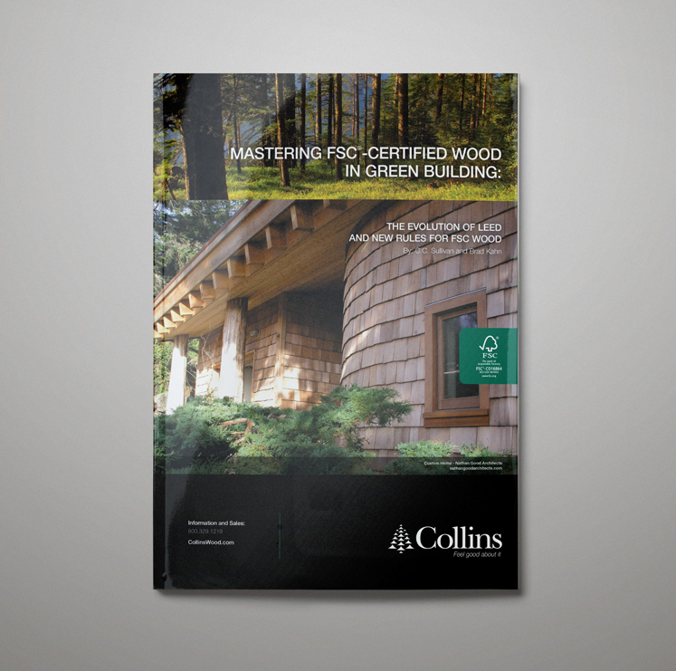


This piece was designed for Collins Companies as an educational download distributed by Architecture Magazine. It was part of an educational series of articles available for architecture and design students.
6: Magazine ad
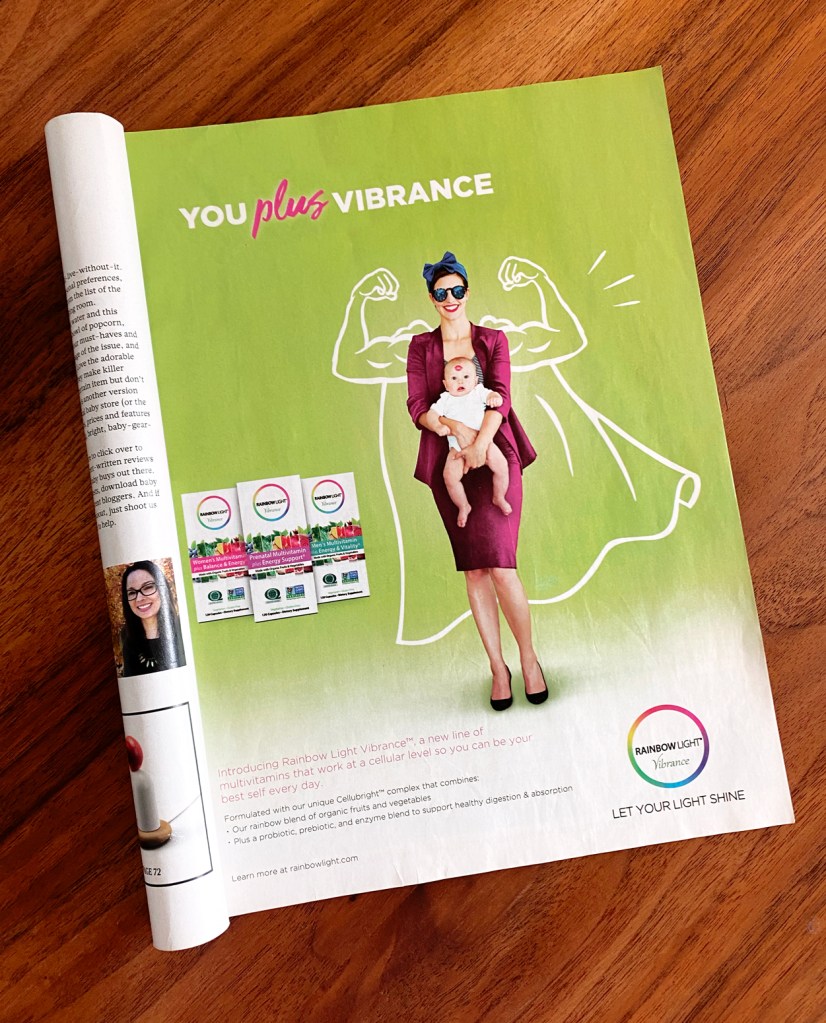
Ad concept, illustration and layout created for Rainbow Light Vibrance multivitamins.
